Lucy Henry
she/her


A multi-disciplinary designer with a focus on branding and logo design, using illustration, photography, 3D modelling, and typography to craft visually compelling projects with depth, clarity, and character.
she/her
This project is a response to the D&AD New Blood Suntory Global Spirits brief. Roku 0% is a sensory-led, mindful drinking campaign designed for Gen Z, 41% of whom link alcohol with anxiety and vulnerability.
Blending Japanese culture with calming design, the campaign offers a more intentional social experience without the pressure to drink. It uses the 5-4-3-2-1 grounding technique, which engages the senses of sight, touch, sound, smell, and taste to ease social anxiety and promote presence.
Roku 0% redefines social drinking, creating space for clarity, connection, and calm.
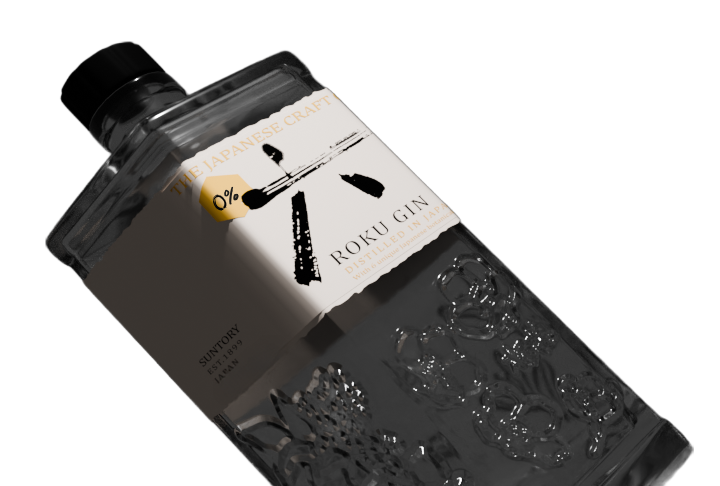
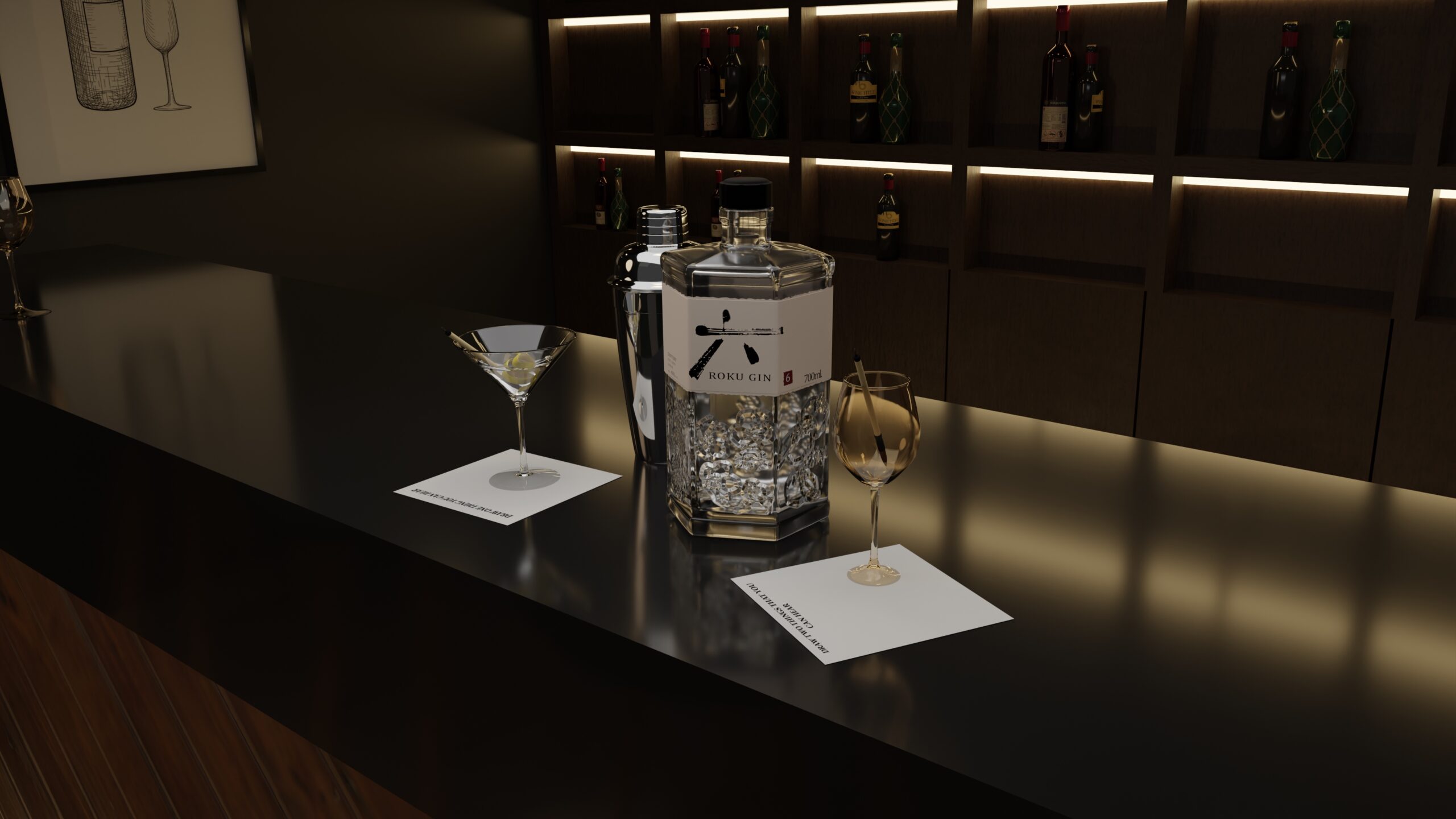
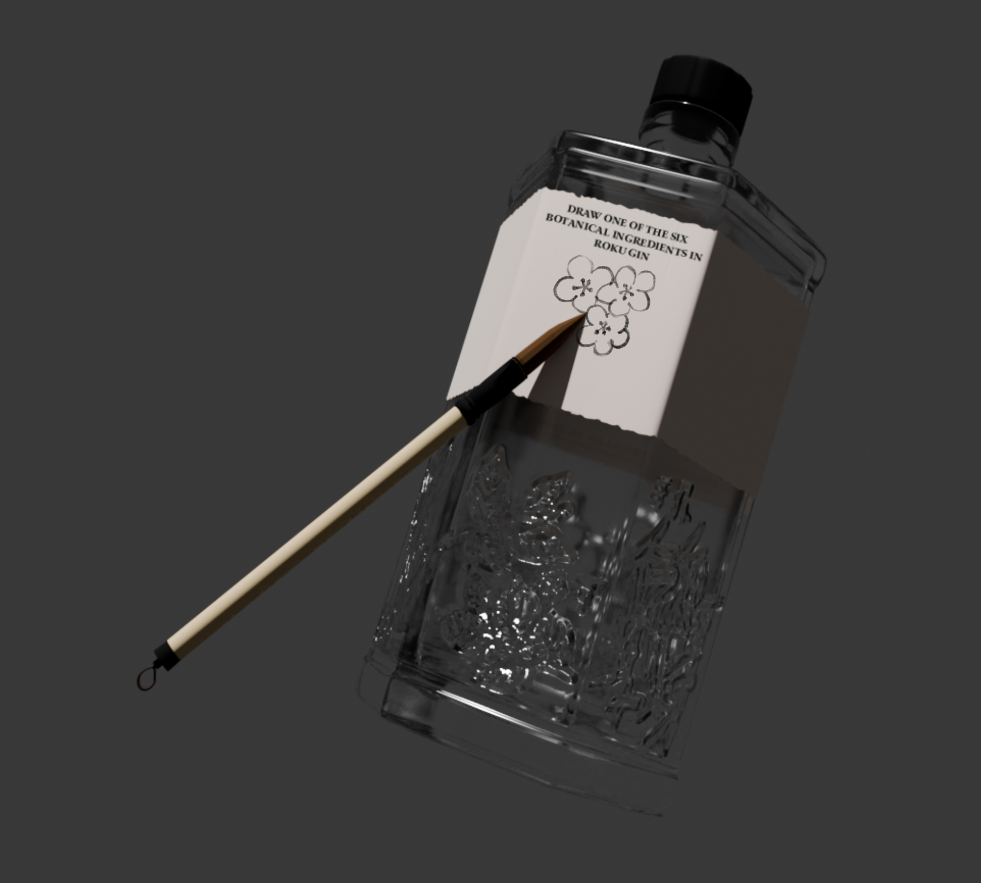
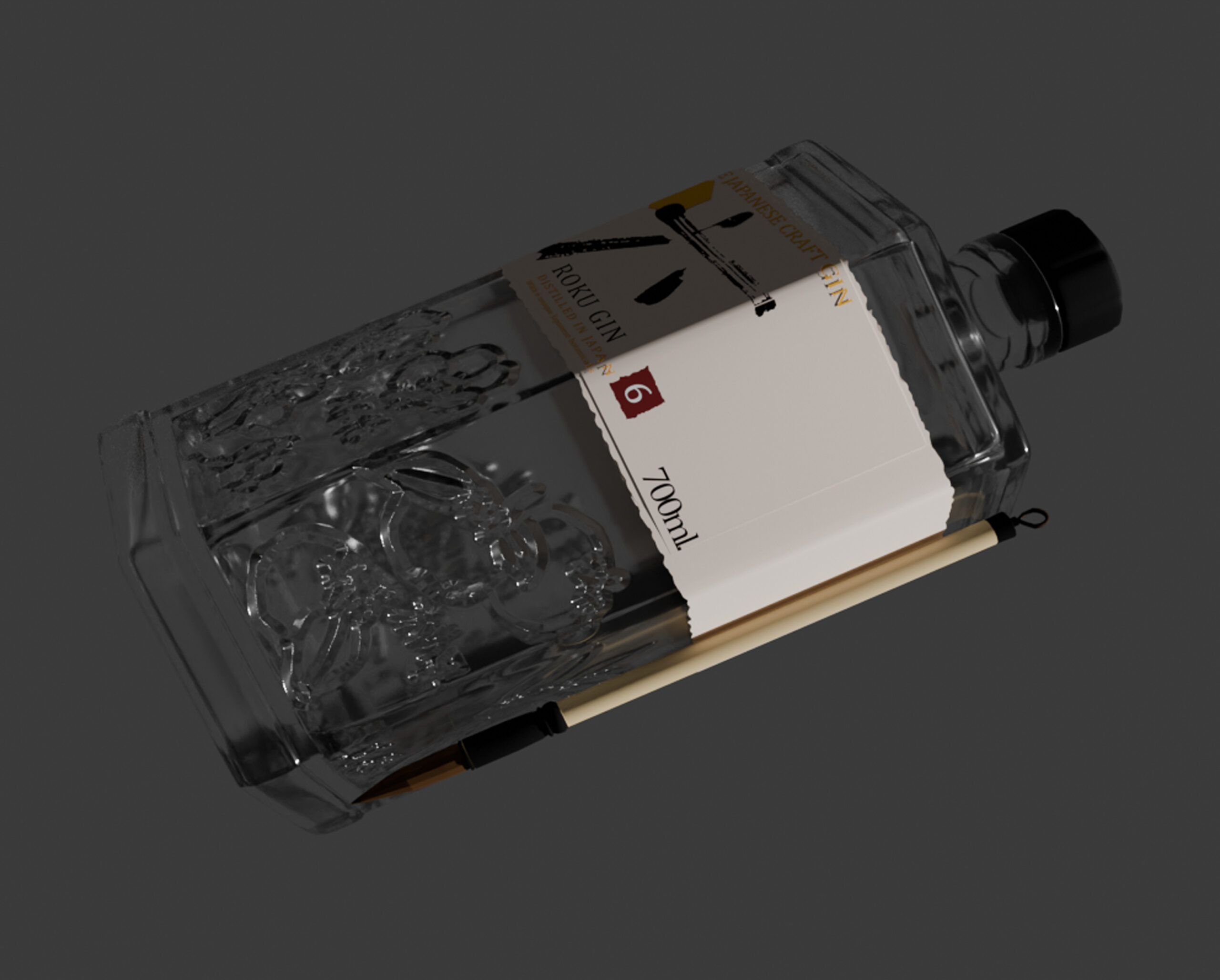
Roku 0% is designed to ground you in the moment, easing the anxieties of being around alcohol. Its label, made from water transfer paper, reacts to water like ink — revealing the users drawings before they gently fade, making it reusable. Each label features prompts like “Draw three things around you” or “Draw one of the six botanical ingredients in Roku Gin”, inspired by the 5-4-3-2-1 grounding technique. A Japanese calligraphy-style brush is attached to every bottle, honouring Roku’s Japanese heritage. The fluid motion of the brush adds to the sense of calm, creating a mindful, immersive experience with every sip.
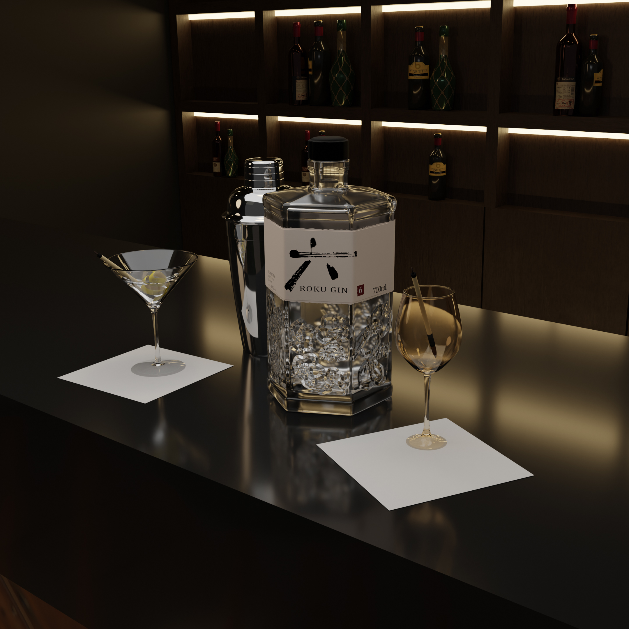
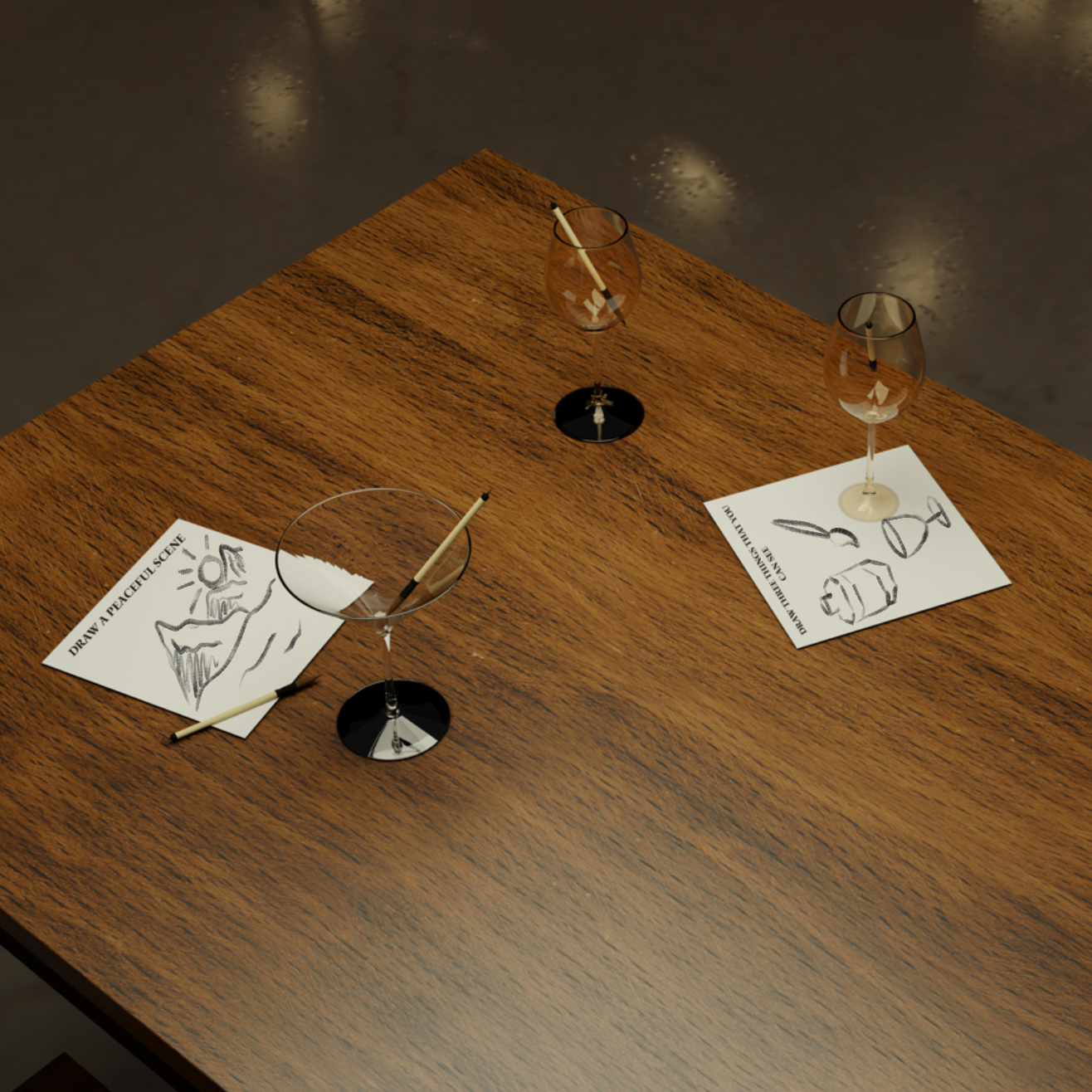
This is an experience that goes beyond the bottle. Gen Z often opt for non-alcoholic drinks while socialising, typically in restaurants or bars, Roku 0% offers a mindful twist. Served with a napkin made from the water transfer paper and a drink stirrer that doubles as a small brush, each drink invites a moment of calm. Similar to the bottle label, the napkins have different prompts written on them.

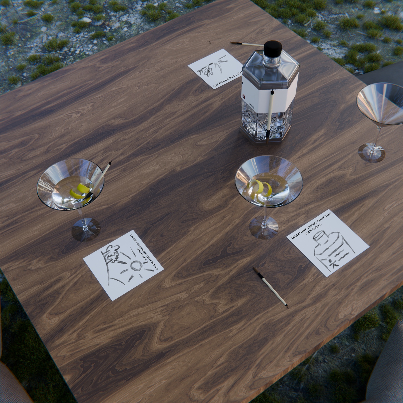
Roku could elevate this experience with a serene pop-up picnic, reflecting its connection to nature. Traditional Japanese Zataku-style tables set in a serene outdoor setting, along with Roku 0% cocktails, served with water transfer napkins and brush stirrers. Calming prompts would encourage mindfulness, inviting attendees to pause, observe, and connect with the present moment and the natural world around them.
For this project, my goal was to provide a fresh and more professional looking brand for a selection of small, local businesses in Loughborough. I specifically chose local enterprises because small businesses often lack the resources or budget to invest in high-quality branding, which can lead to inconsistent or outdated visual identities. Unlike larger corporations with dedicated marketing teams, small businesses frequently treat branding as an afterthoughtif they consider it at all.
This project is important as effective branding plays a crucial role in shaping how a business is perceived by its customers. Strong visual identity builds trust, recognition, and loyalty, which are all elements that are essential for long-term success. Without this, even the most valuable services or products could go unnoticed or undervalued.
Through the creation of these logo designs, I aim to help these businesses stand out in a crowded market, feel more confident in their presentation, and ultimately attract more customers. My hope is that this work not only elevates their presence but also lets them to take pride in how they represent themselves to the world.

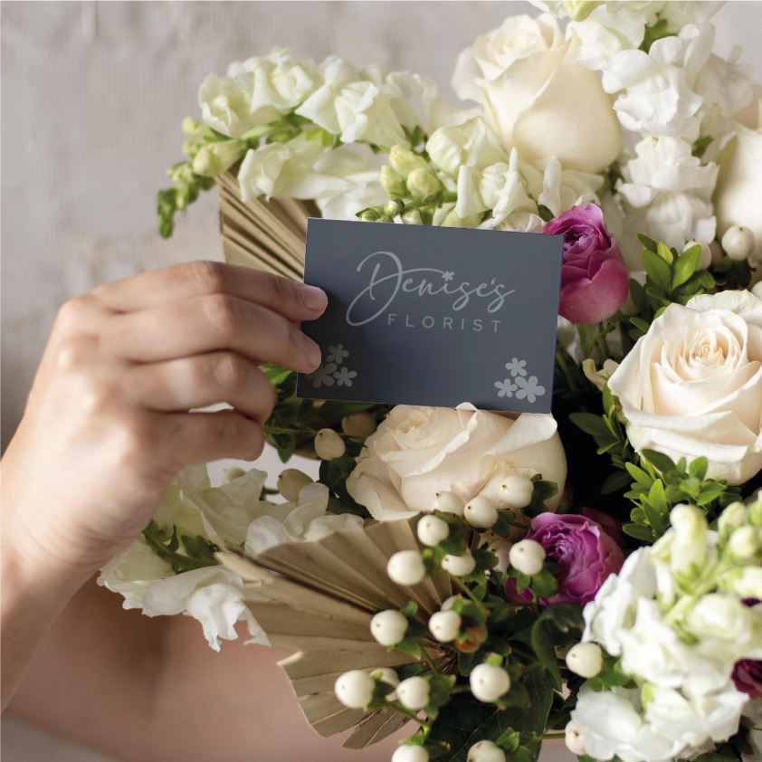
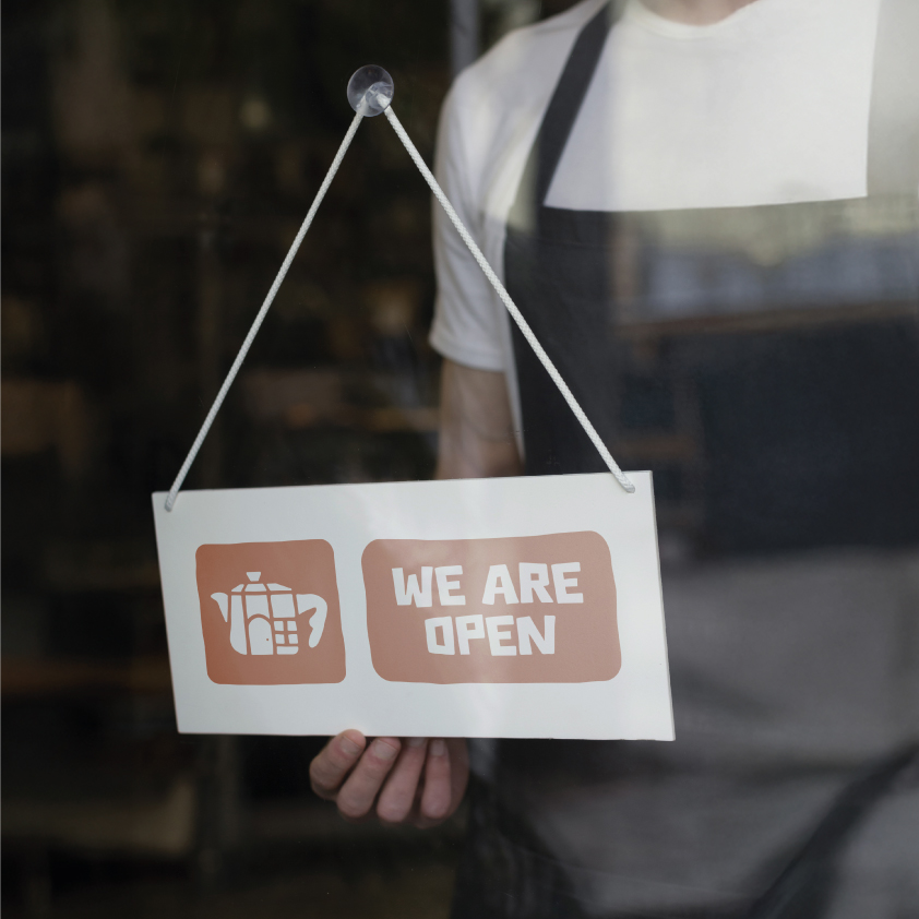
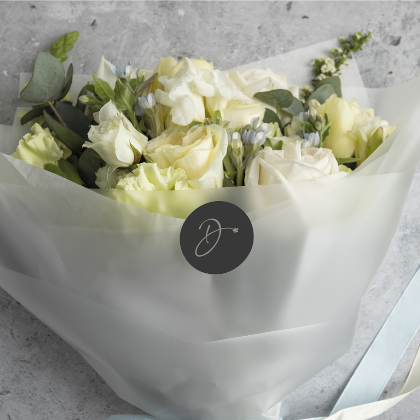
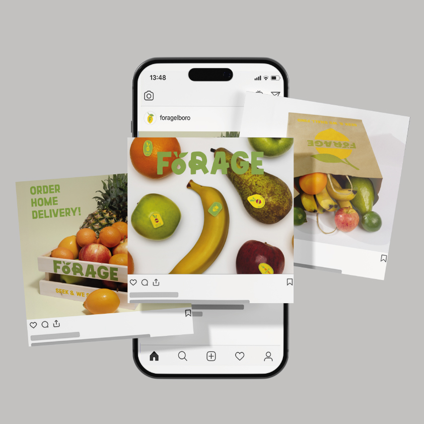
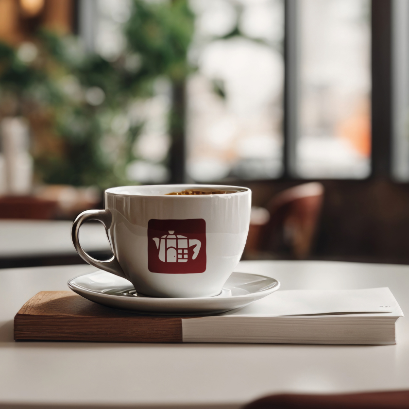
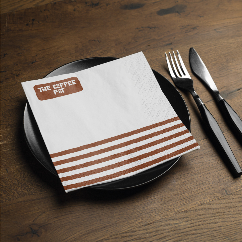
Below are some mockups that I thought were fitting for each business to provide more context into how the new logos could be used