Sam Hui


I’m a graphic designer who’s passionate about exploring identity, culture, and social impact. I’m driven by curiosity and emotion and I love using storytelling and typography to create work that connects with people.

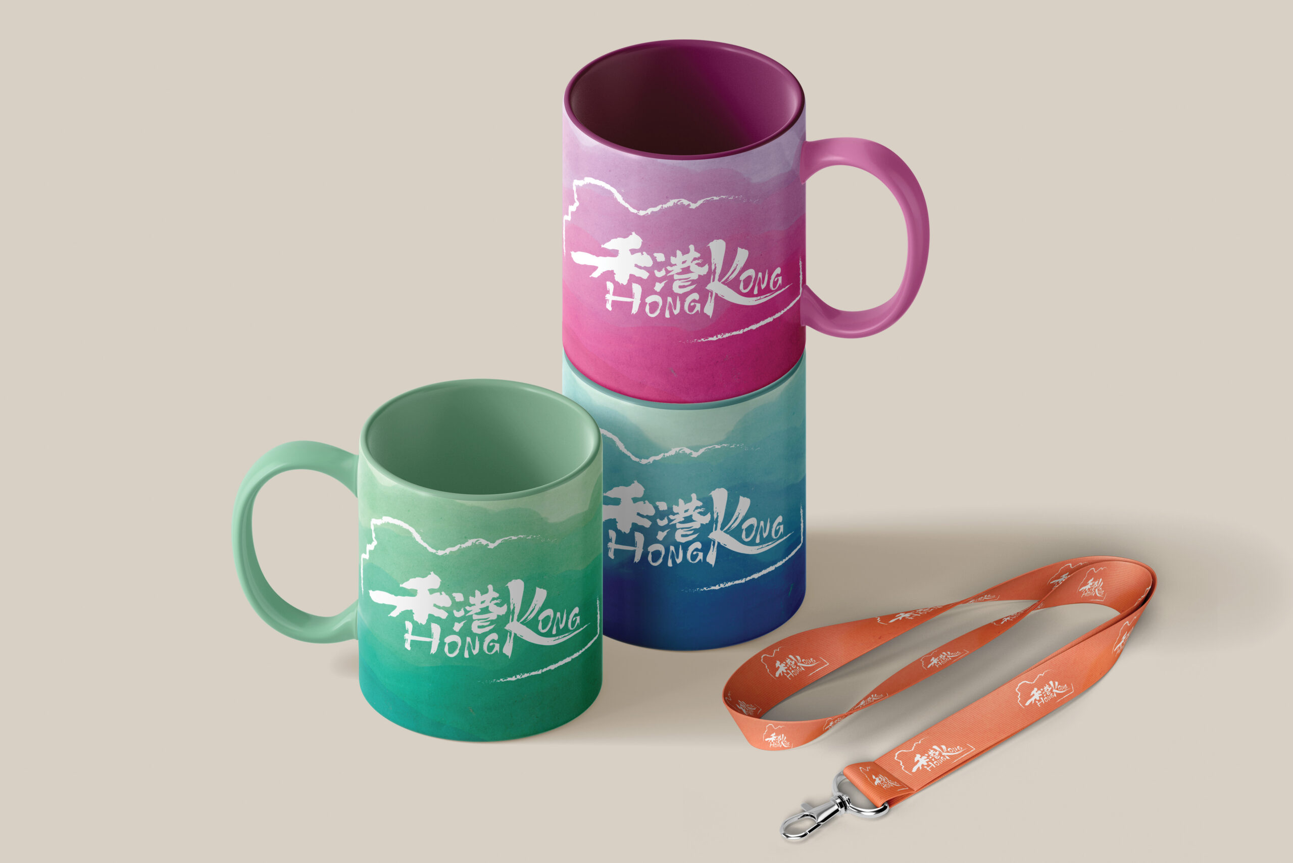
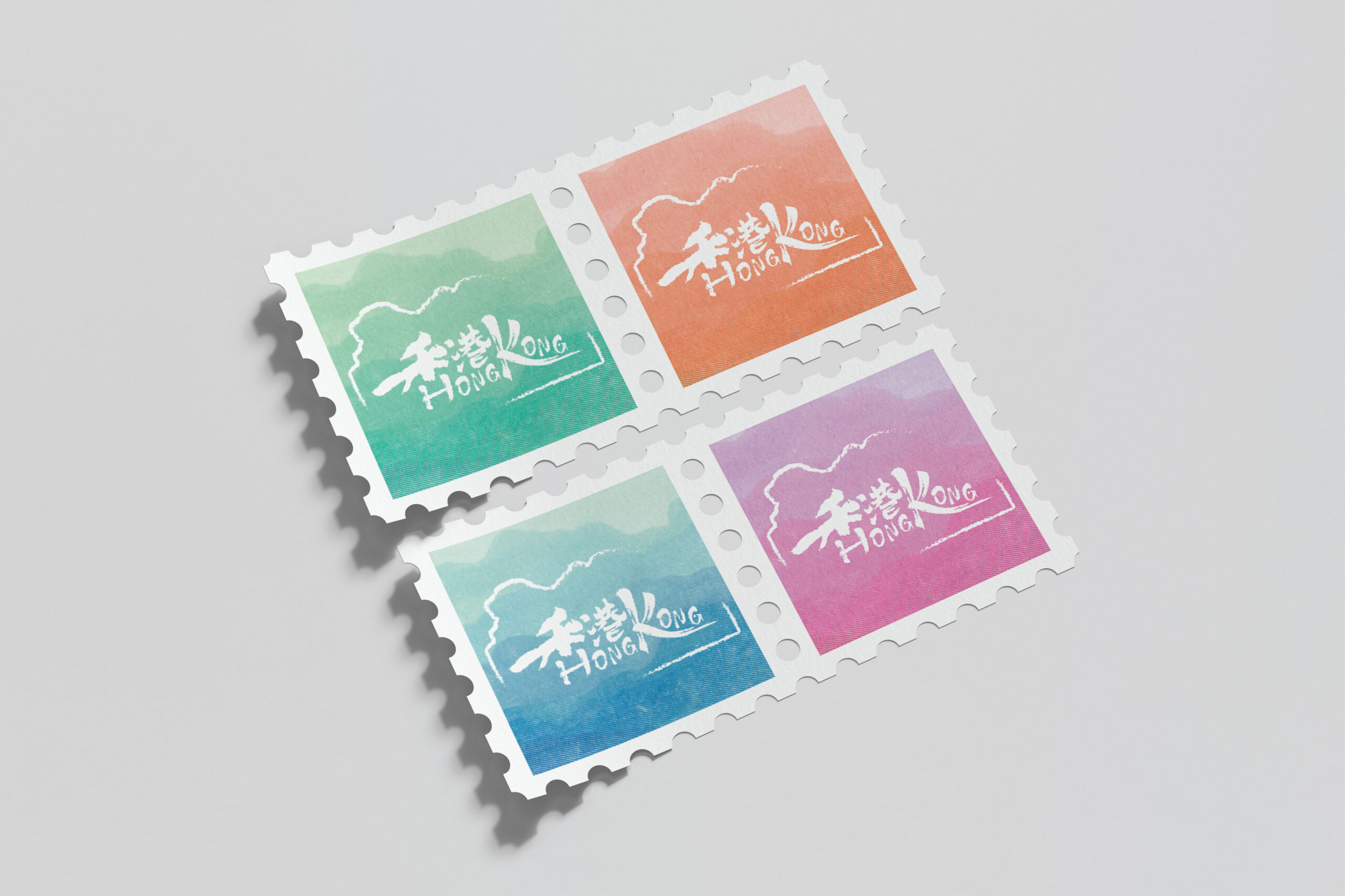
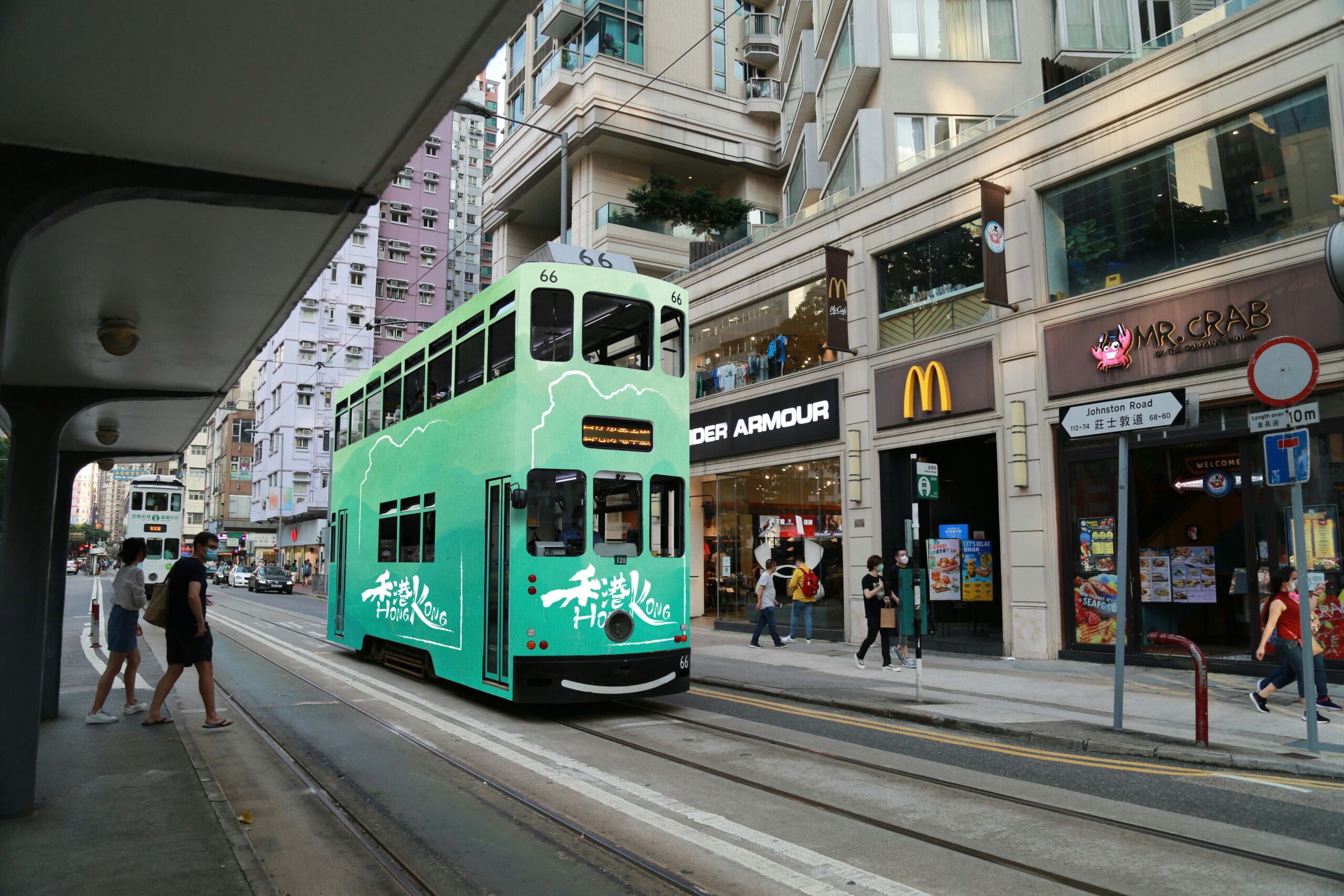
This project is a rebrand of Hong Kong’s city identity, blending Chinese and English typography to reflect the city’s unique cultural mix. It’s not just a rebrand, but a way to reconnect the city with its people. A simple, symbolic frame invites everyone to define Hong Kong through their own perspective.

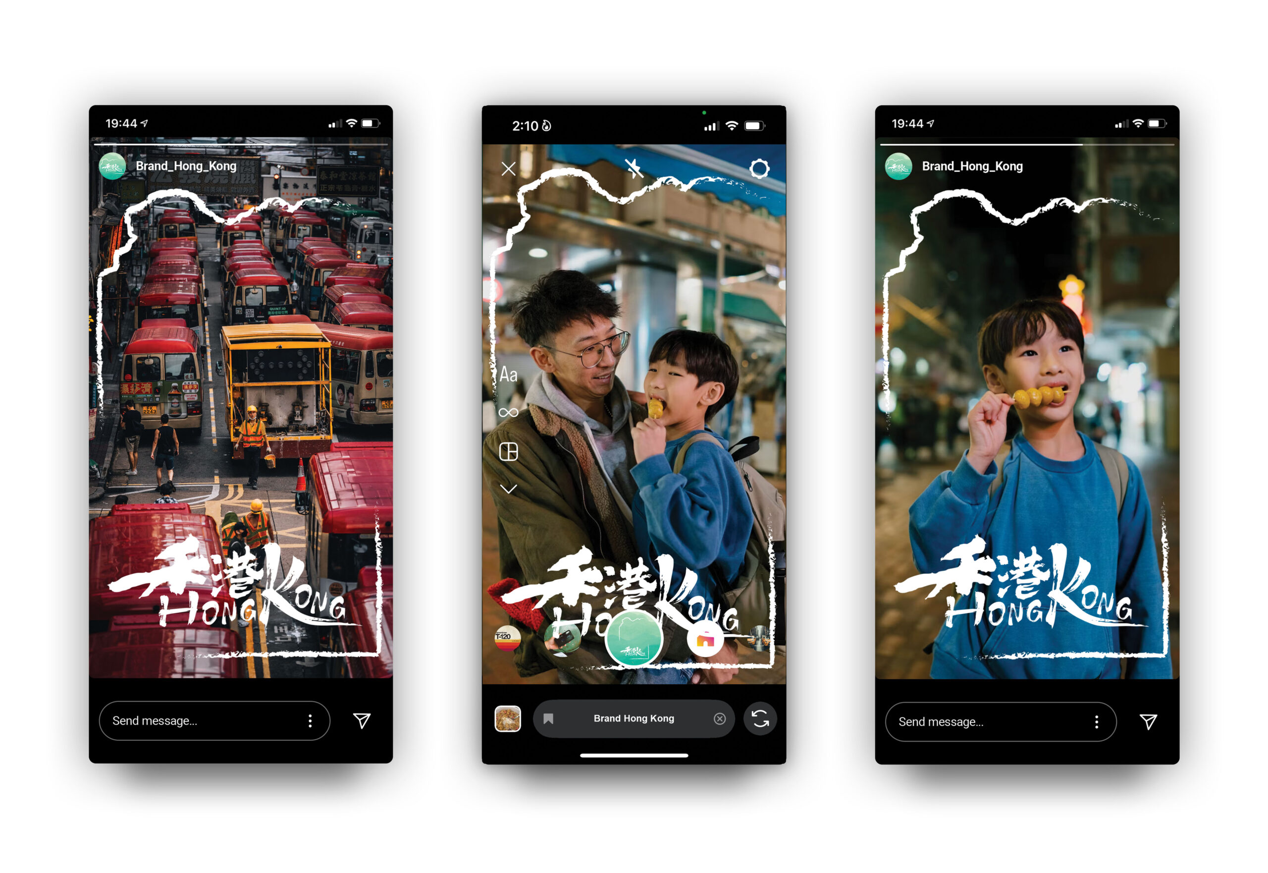
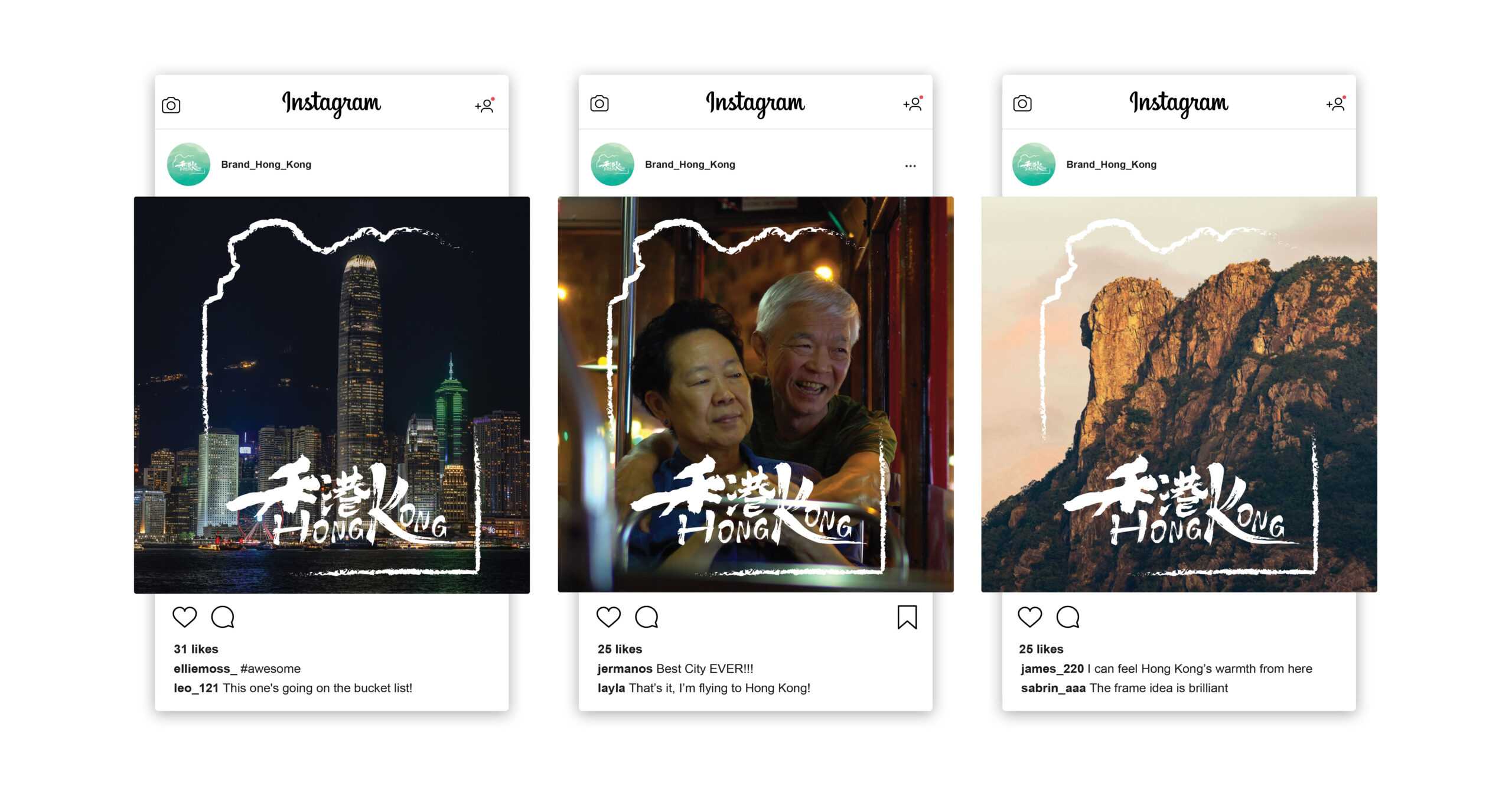
As part of the rebrand, a social media filter was developed to encourage people to share their own perspective of Hong Kong. Using the brand’s symbolic frame, the filter invites users to capture moments that reflect their personal connection to the city. This interactive feature reinforces the idea that Hong Kong’s identity is shaped by its people—through everyday experiences, places, and emotions.
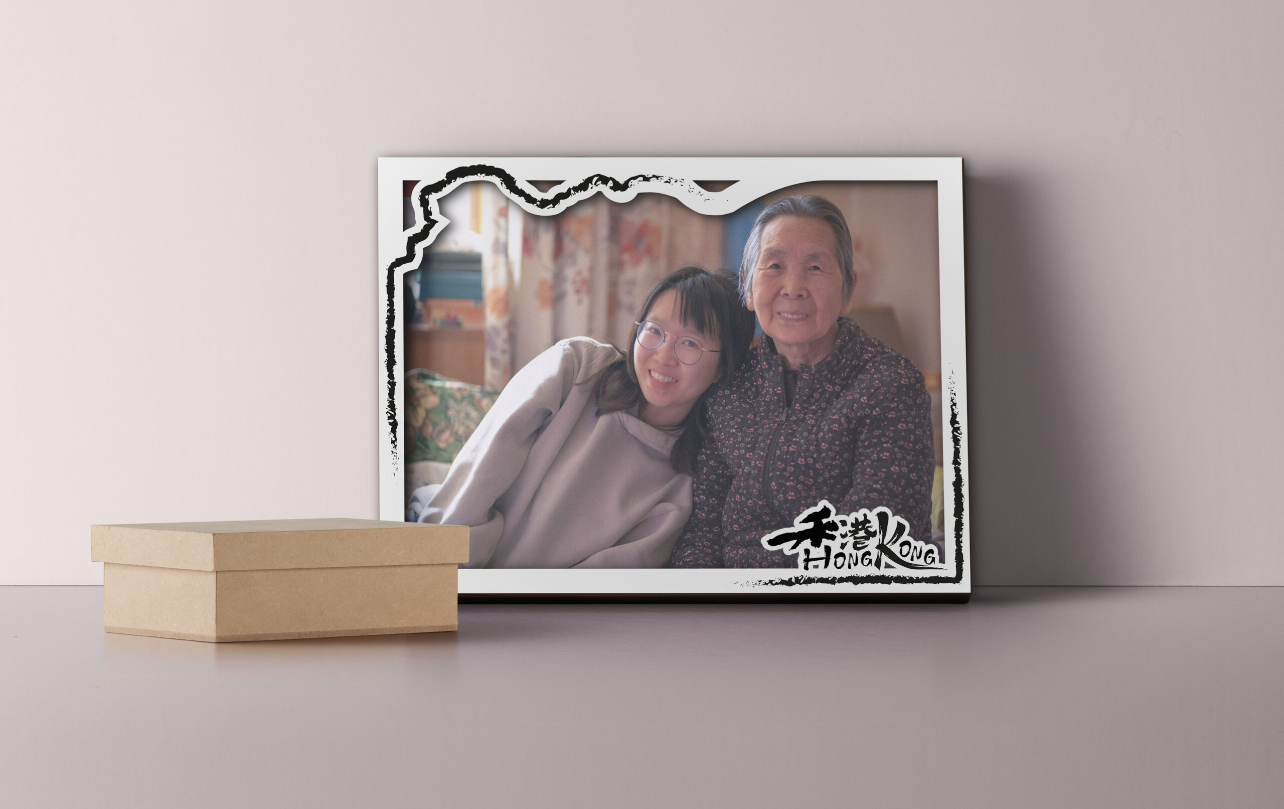
A physical photo frame was created to let people share what Hong Kong means to them in a personal way. By placing their favourite photo inside the frame whether it’s a place they love, a special memory or a quiet everyday moment—they become part of the story. It’s a simple, meaningful way to show that the identity of Hong Kong is shaped by the people who live it.
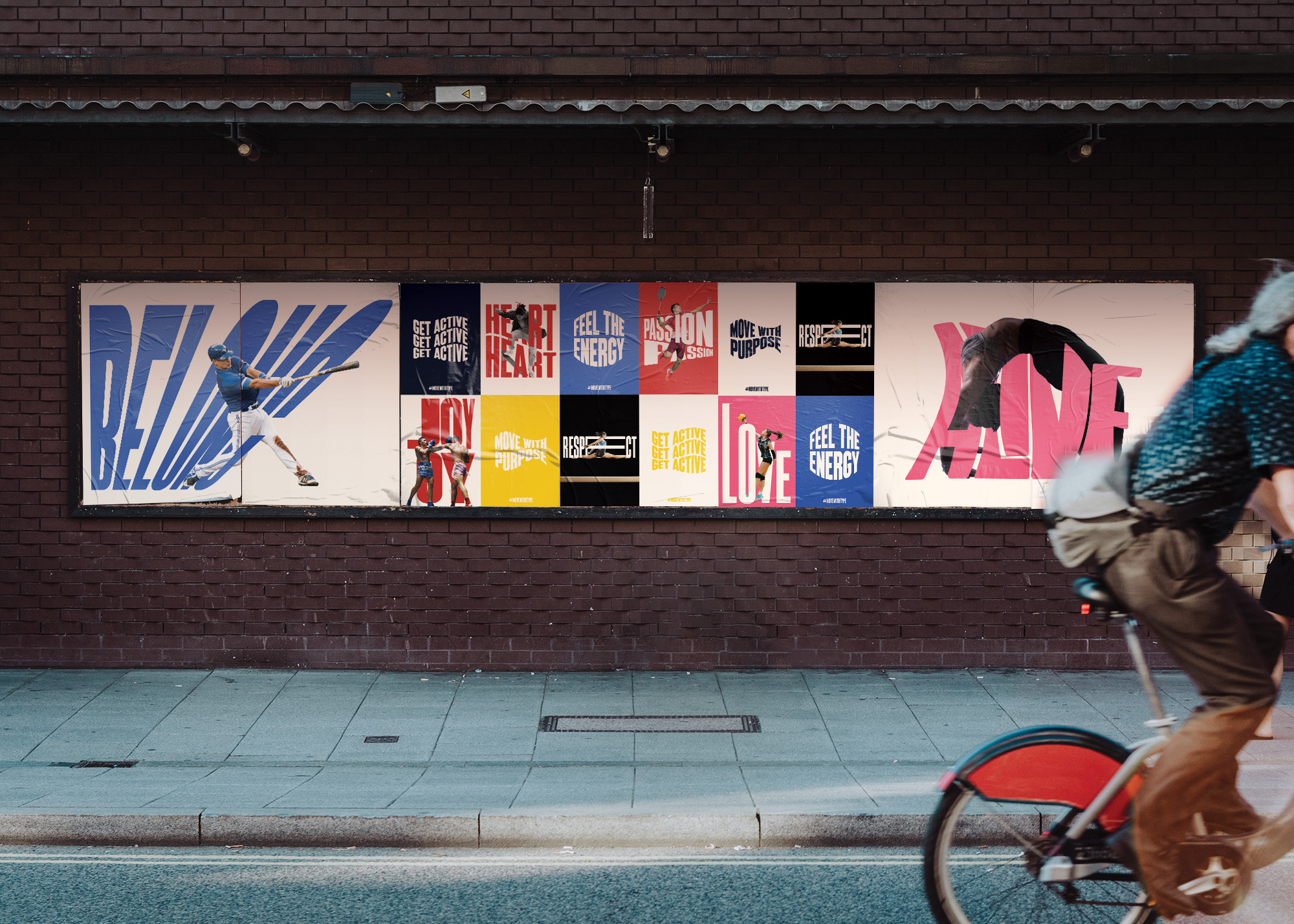
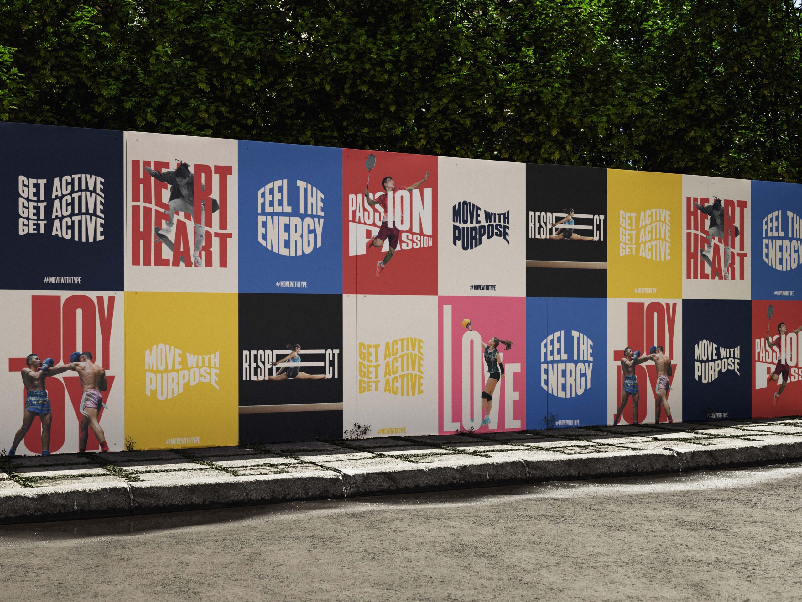
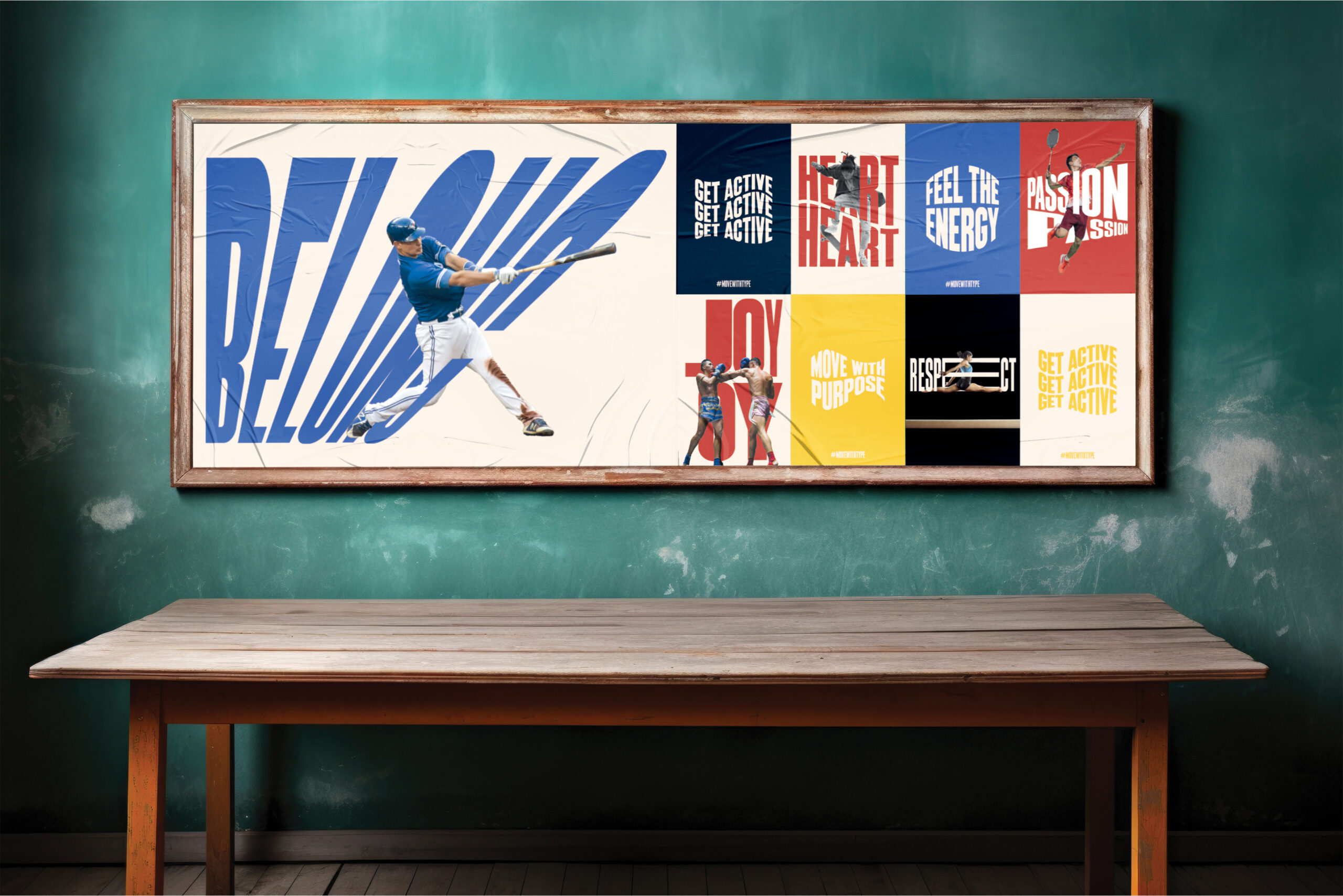
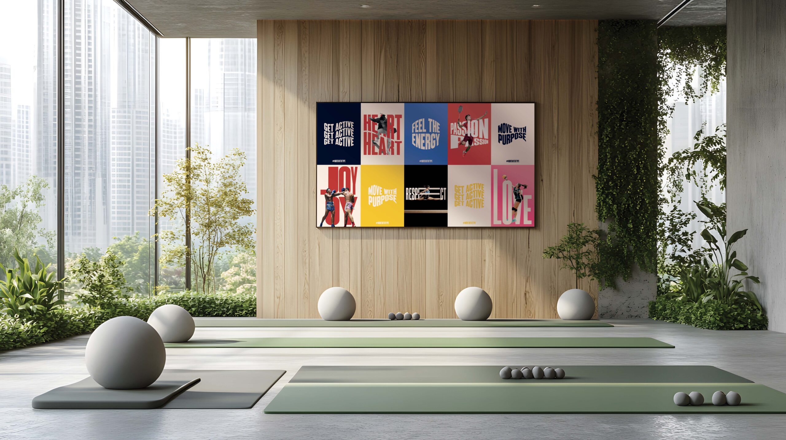
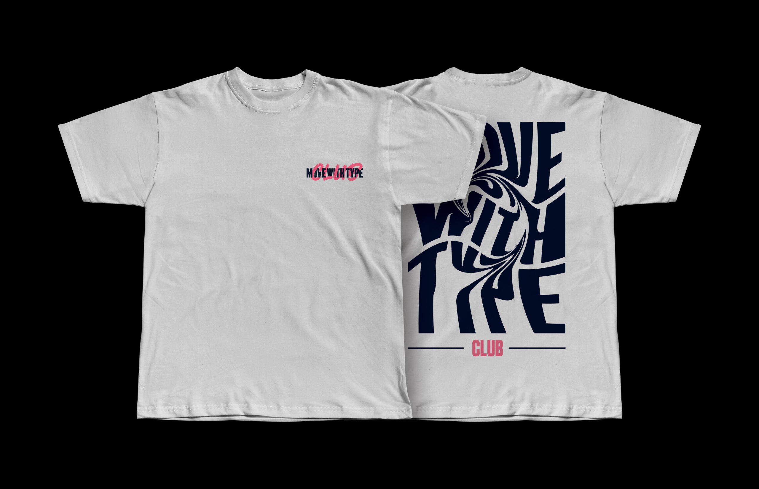
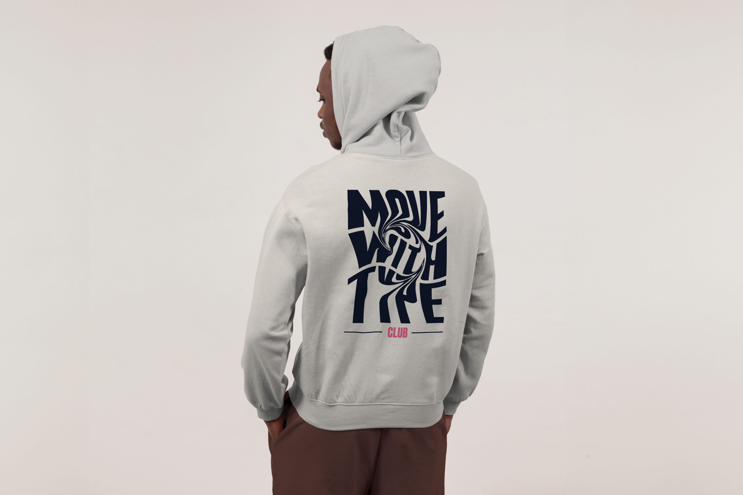
Move With Type is a poster series that brings the heart back into sport. Many young people are stepping away from physical activity because it often feels too competitive or stressful. This project shifts the focus to the joy, energy, and emotional connection that movement can offer. Using expressive typography, each poster highlights words like “Joy”, “Alive”, “Respect”, “Belong” with the type designed to move in a way that reflects the rhythm and spirit of each sport. The series encourages a more inclusive and playful view of sport—one that’s about expression, connection, and enjoying the moment.