Joe Woodcock
He/Him


A passionate graphic designer specialising in branding and visual storytelling. My work focuses on crafting meaningful, impactful identities that connect businesses with their audiences.
He/Him
The aim of this project is to tackle the issue of tent waste at music festivals through a bold, youth-focused brand that offers sustainable tent rental and reward systems. Combining strategic branding, app design, and campaign messaging, Trekka challenges throwaway culture by offering a more rewarding, conscious alternative.
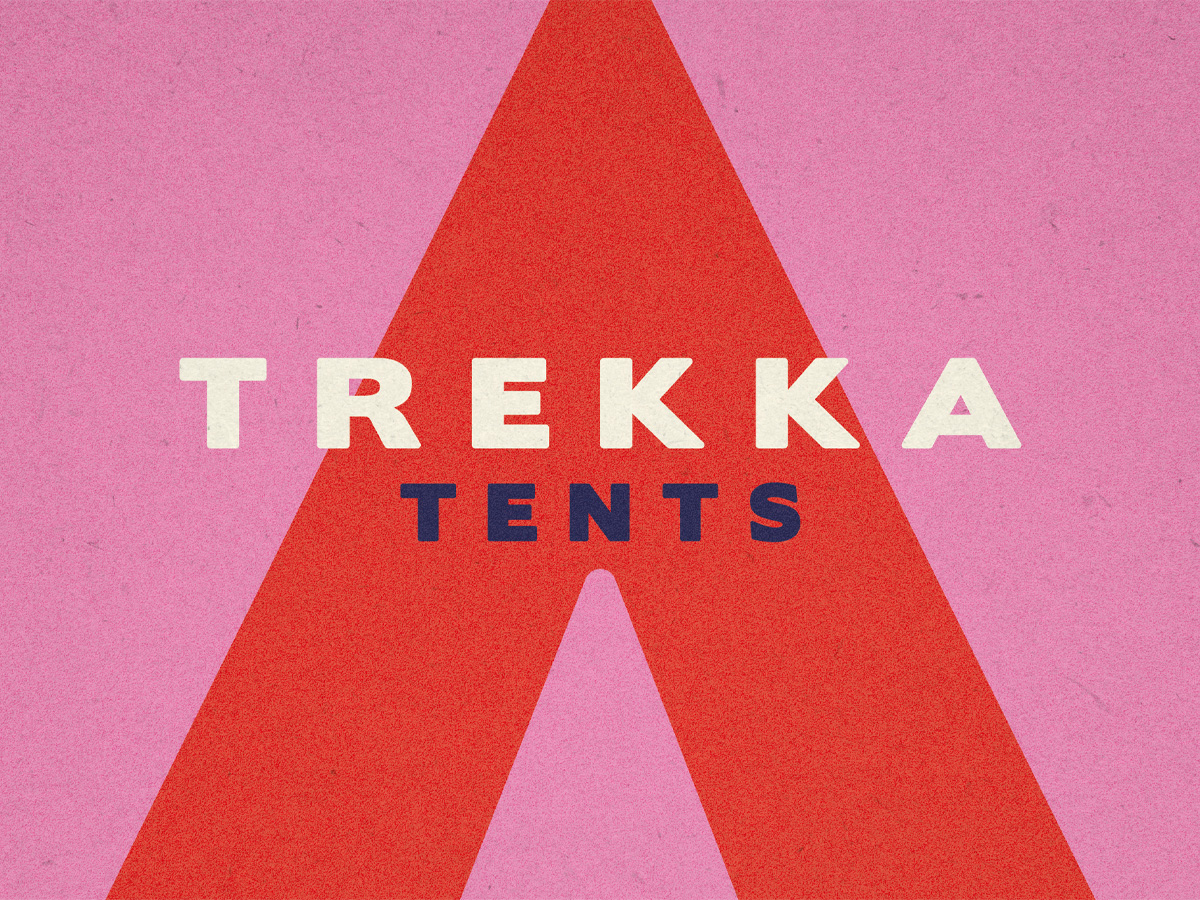
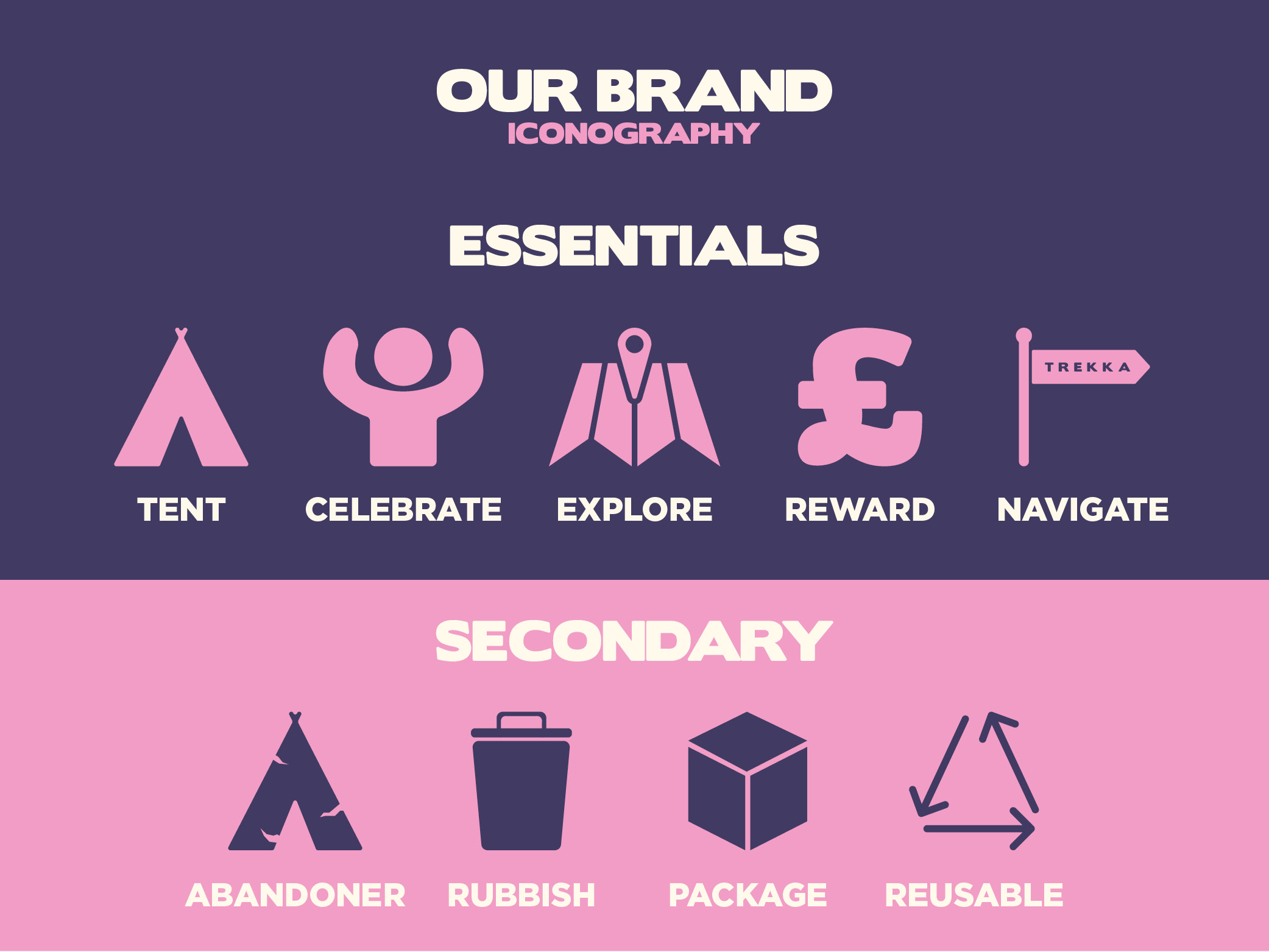
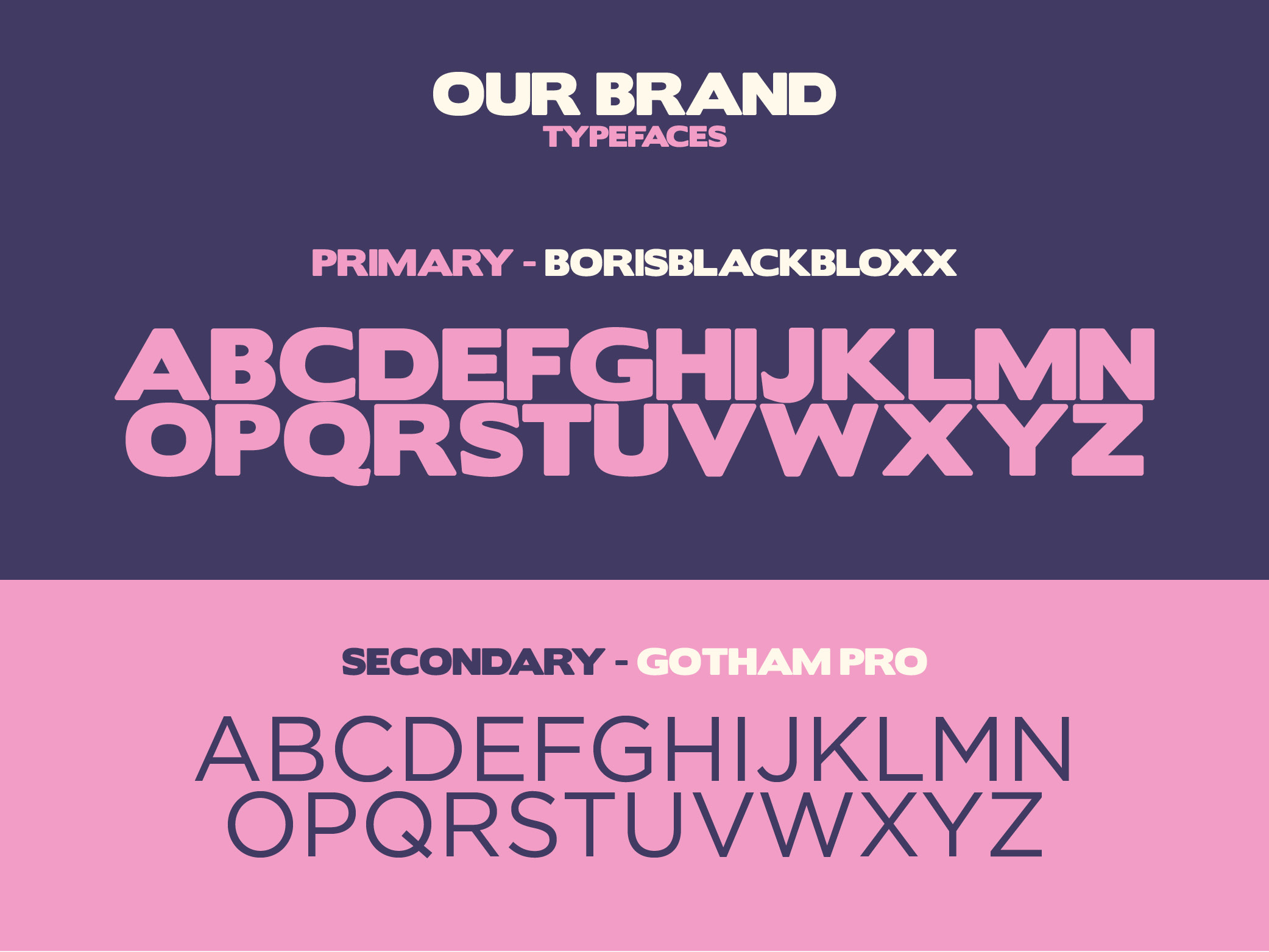
Trekka’s visual identity takes a bold yet playful approach, combining a confident type system with a vibrant, cohesive colour palette. The final look embraces a clean, welcoming aesthetic, one that still feels energetic and youth-oriented, but with greater clarity and purpose. The use of BorisBlackBloxx as the primary typeface provides strong visual weight, balanced by the friendly professionalism of Gotham Pro. The colour scheme, with soft creams, vibrant pinks, deep navies, and a punchy orange, helps to communicate the brand’s balance of fun and function. Meanwhile, custom iconography reinforces key actions and values across the app and promotional content, giving Trekka a clear, accessible and engaging visual language.

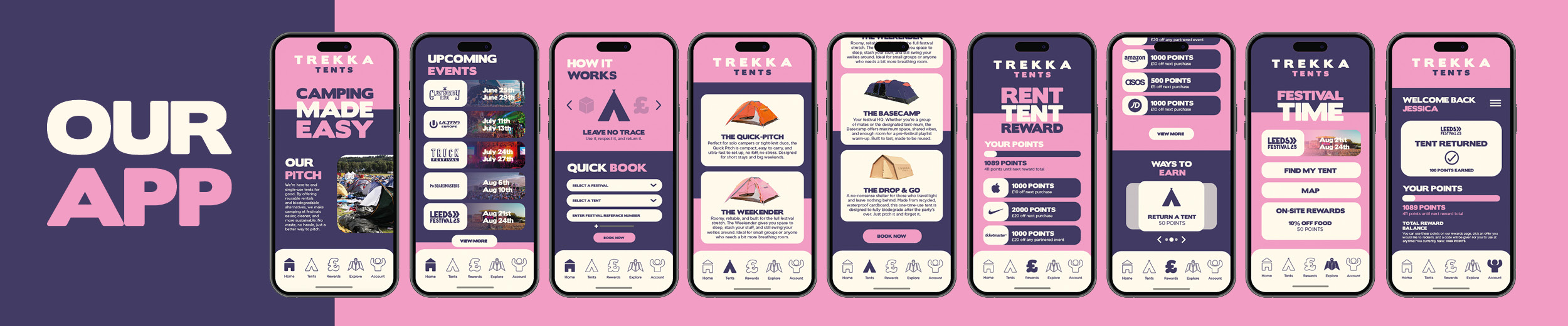
The Trekka app acts as the digital companion to the festival experience, designed to be both practical and intuitive. Users can browse and reserve tents ahead of time, navigate the festival site using the built-in map, and even earn rewards for responsible behaviour, such as returning tents or referring friends. The app also allows for real-time updates and reminders, helping reduce confusion and improve the overall experience. Every screen is designed with the Trekka brand in mind, blending bold iconography and a youthful colour palette with streamlined functionality. The app reinforces the Trekka ethos of fun, freedom, and accountability — all at your fingertips.
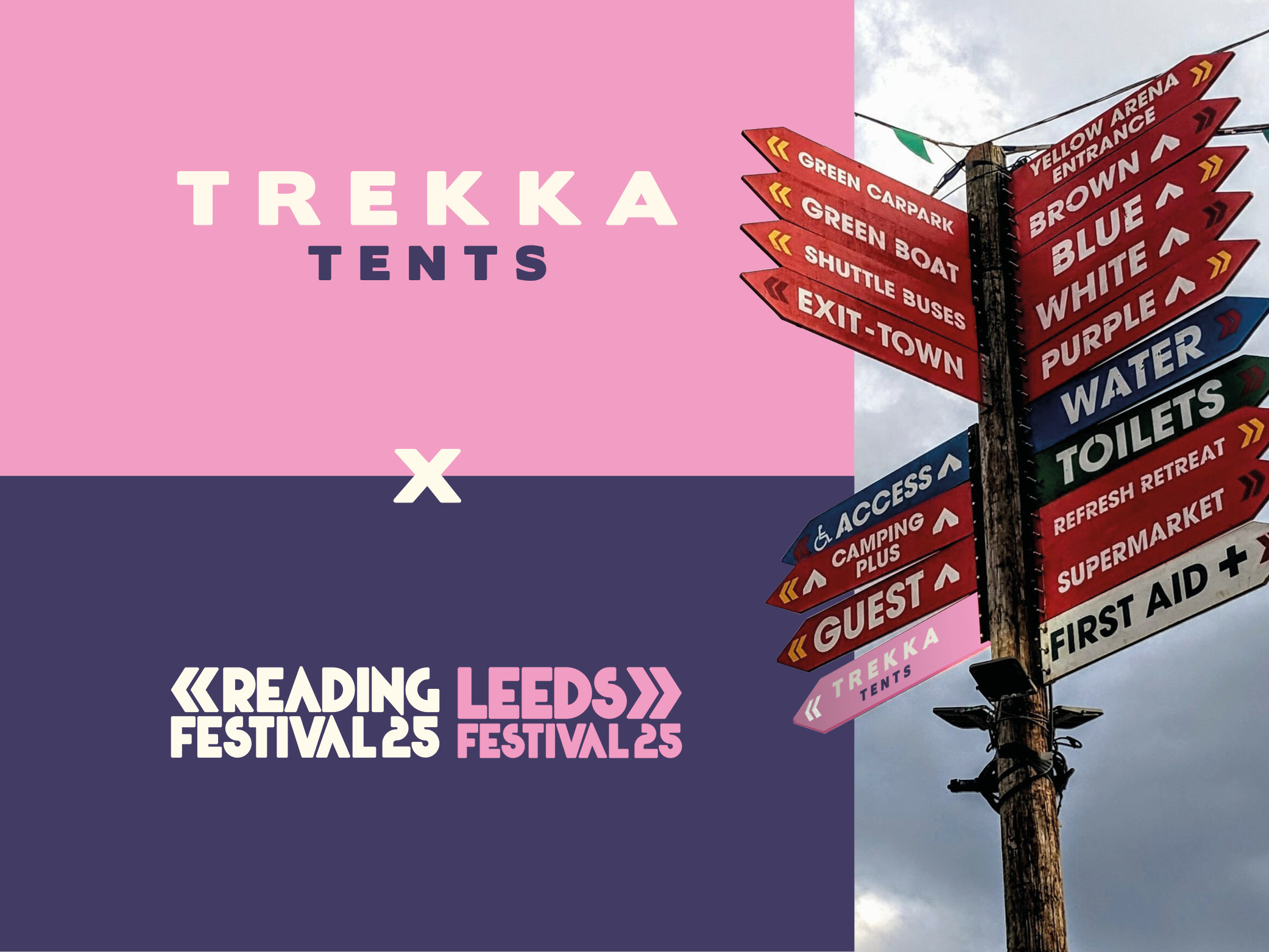
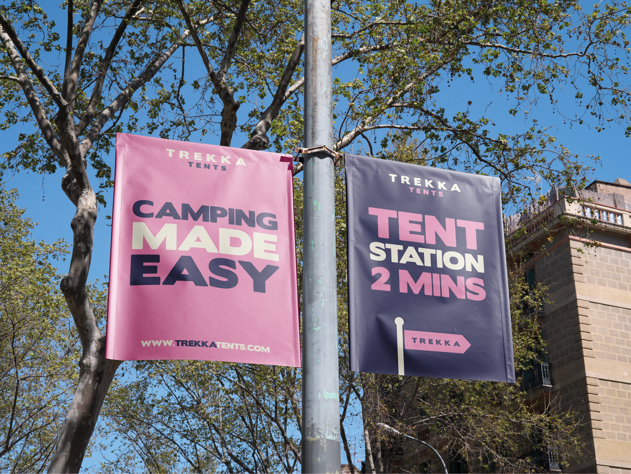
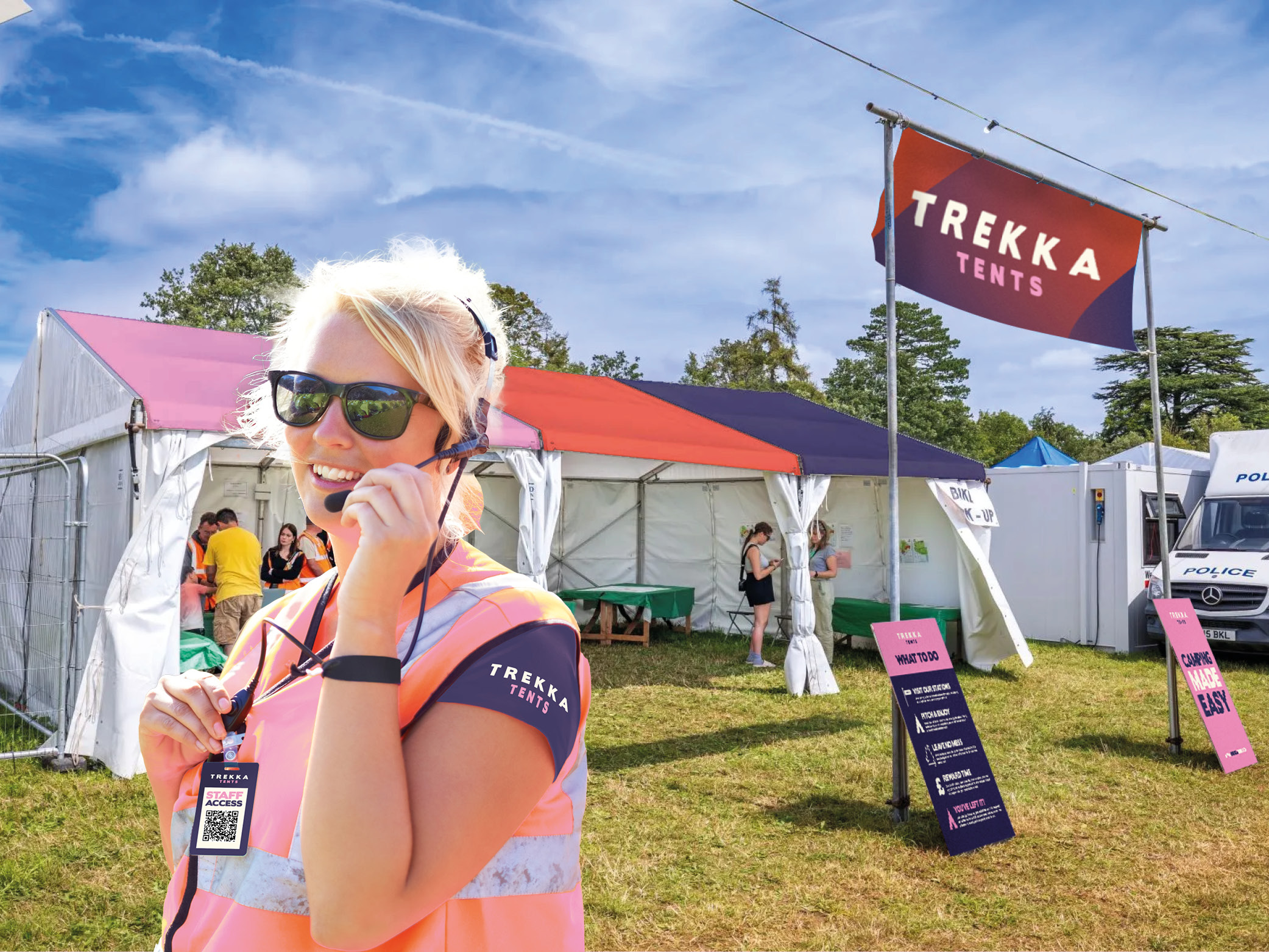
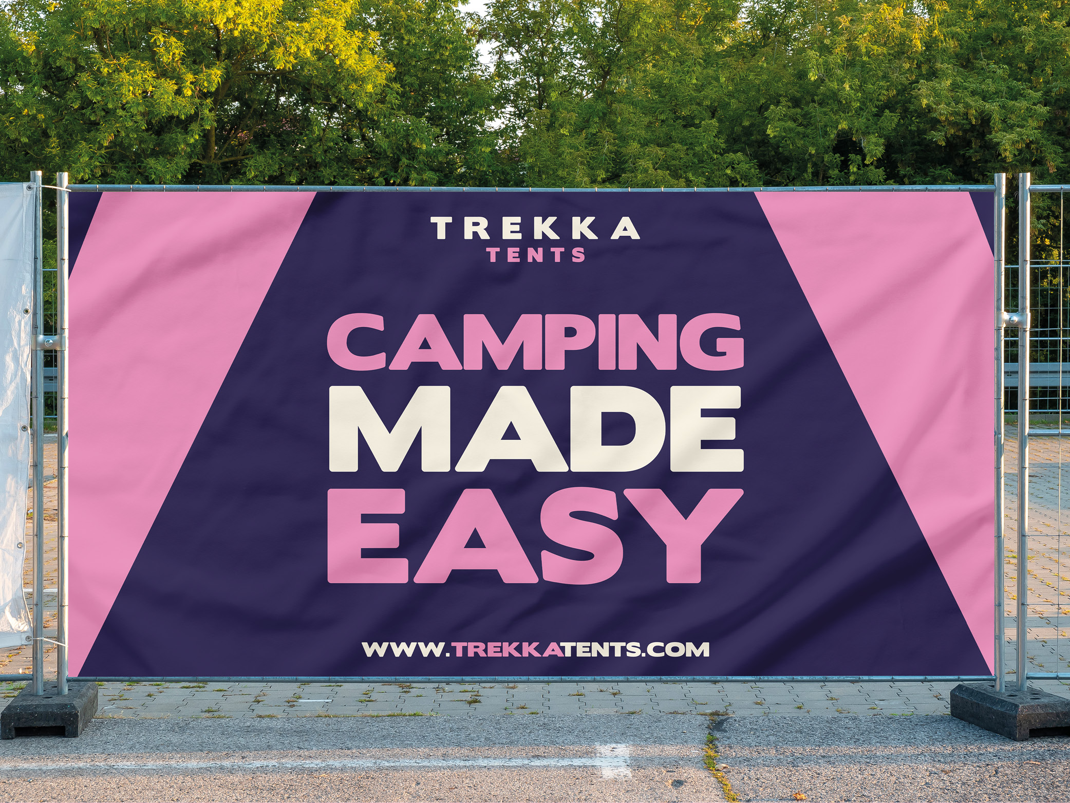
The Trekka campaign envisions a high-impact collaboration with major UK music festivals such as Reading and Leeds. The campaign would centre around an on-site Trekka Station, a dedicated hub where festival-goers can check in, collect or drop off reusable tents, and access information about the initiative. Bold way-finding and branded signage would guide attendees seamlessly through the festival grounds, encouraging engagement and visibility. The Trekka Station itself acts as both a functional point and a brand statement, reinforcing sustainable behaviours in a way that feels integrated into the festival experience. By aligning with these large-scale events, the campaign reaches a highly relevant audience, driving home the message of conscious camping and community participation.
To support the wider campaign, a dynamic promotional video has been created to drive awareness across social media and digital platforms. With an upbeat edit style and energetic sound design, the video captures the spirit of Trekka. Designed to resonate with younger audiences, the video combines footage with motion graphics to introduce the brand in a concise, shareable format. This digital content acts as a gateway to the full Trekka experience, encouraging engagement, downloads, and spreading the core message of reducing waste in a celebratory way.
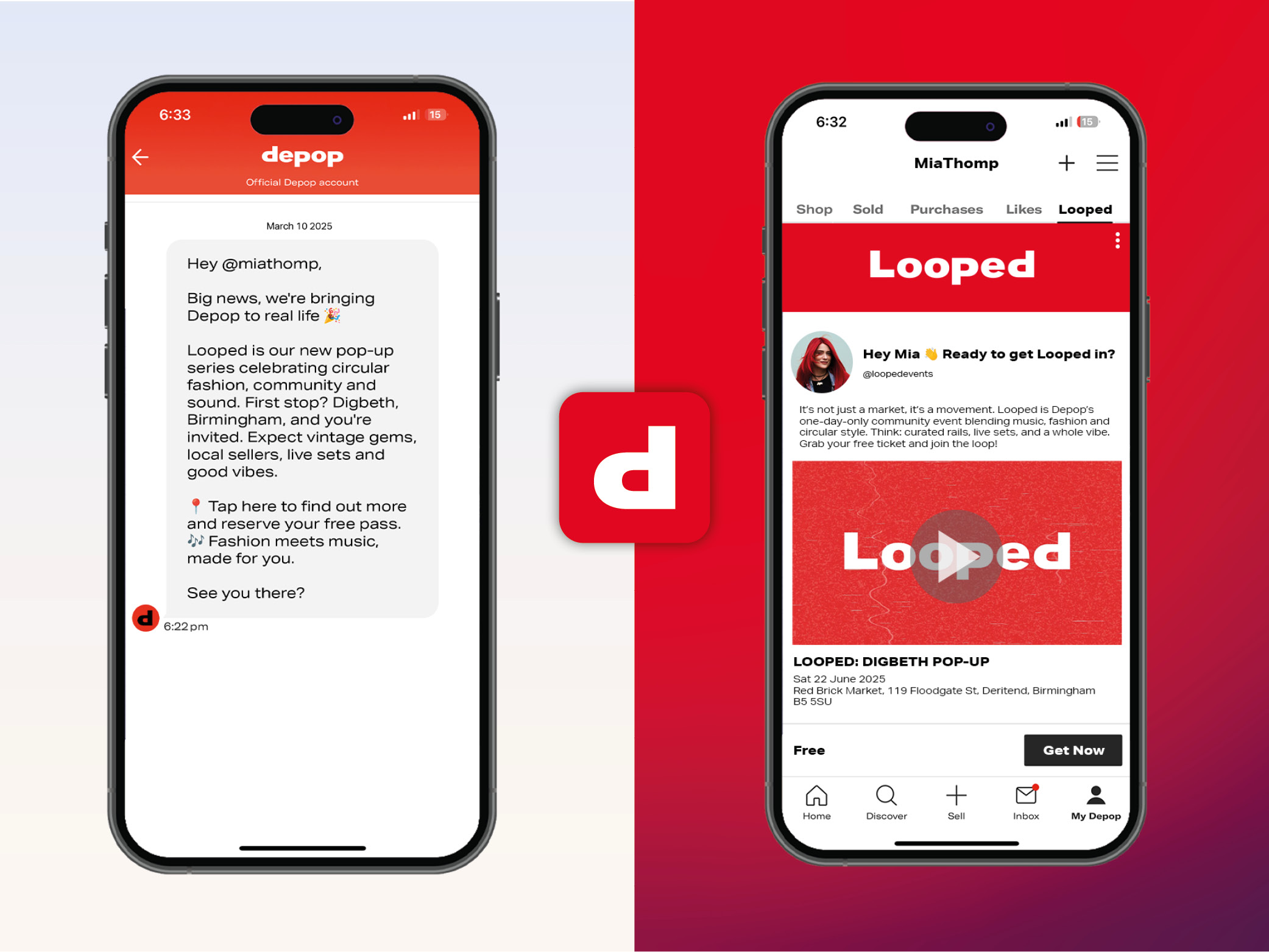
The aim of this project is to reignite interest in Depop through a real-world campaign that celebrates circular fashion, self-expression, and community. Looped brings the Depop experience offline with a pop-up event concept that blends vintage shopping with music culture, set in Birmingham’s creative district of Digbeth. Through strategic branding, video content, and integrated in-app features, Looped reconnects users with the platform in a fresh, tangible way. The campaign Encourages discovery, connection, and sustainable style in a setting that feels uniquely Depop.
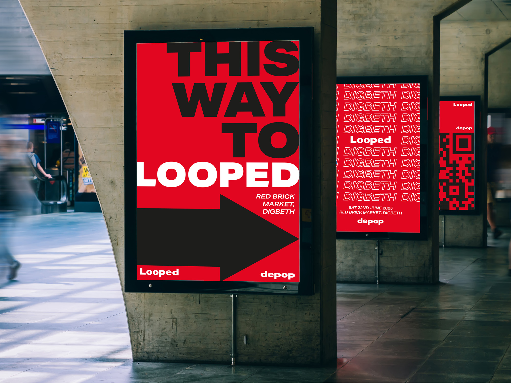
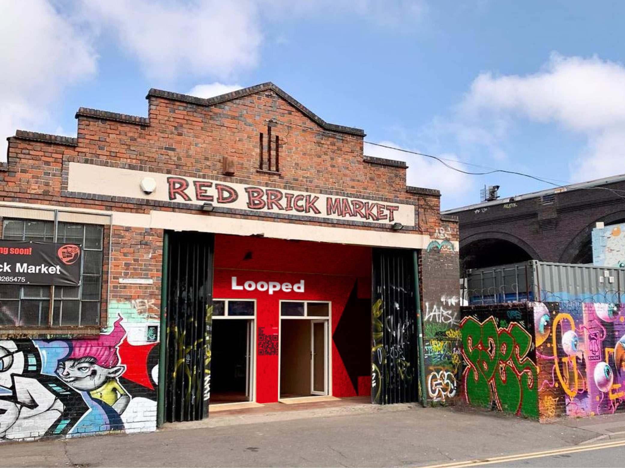
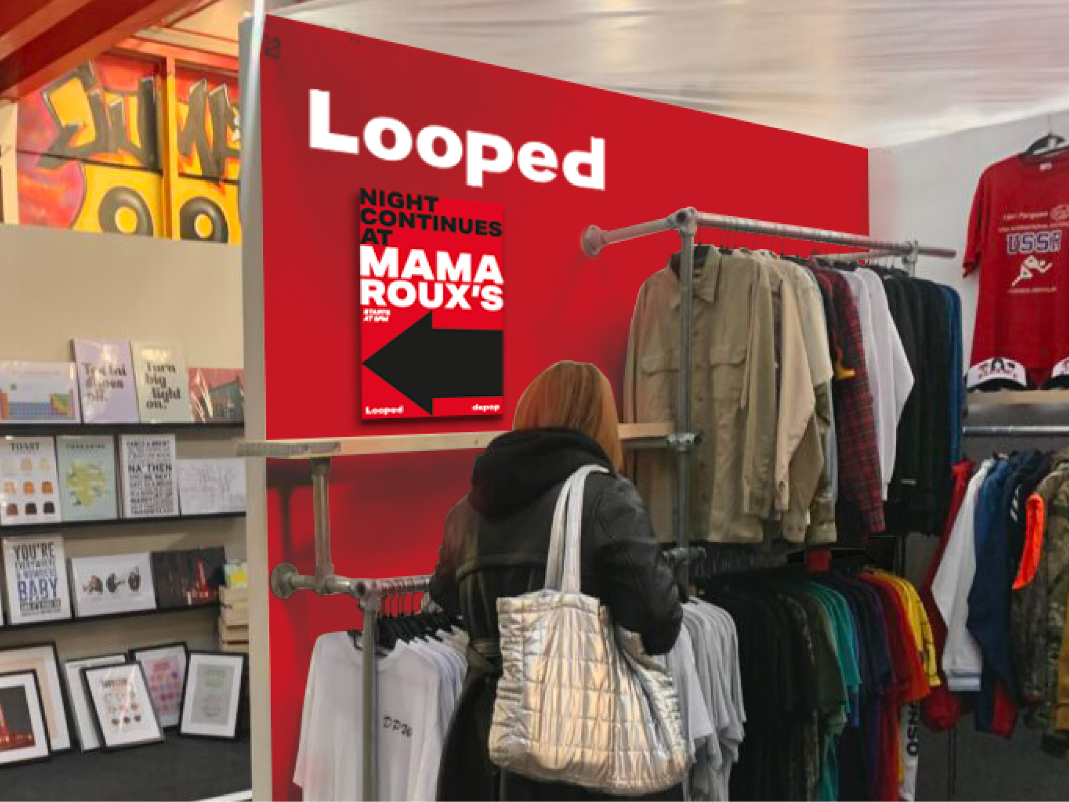
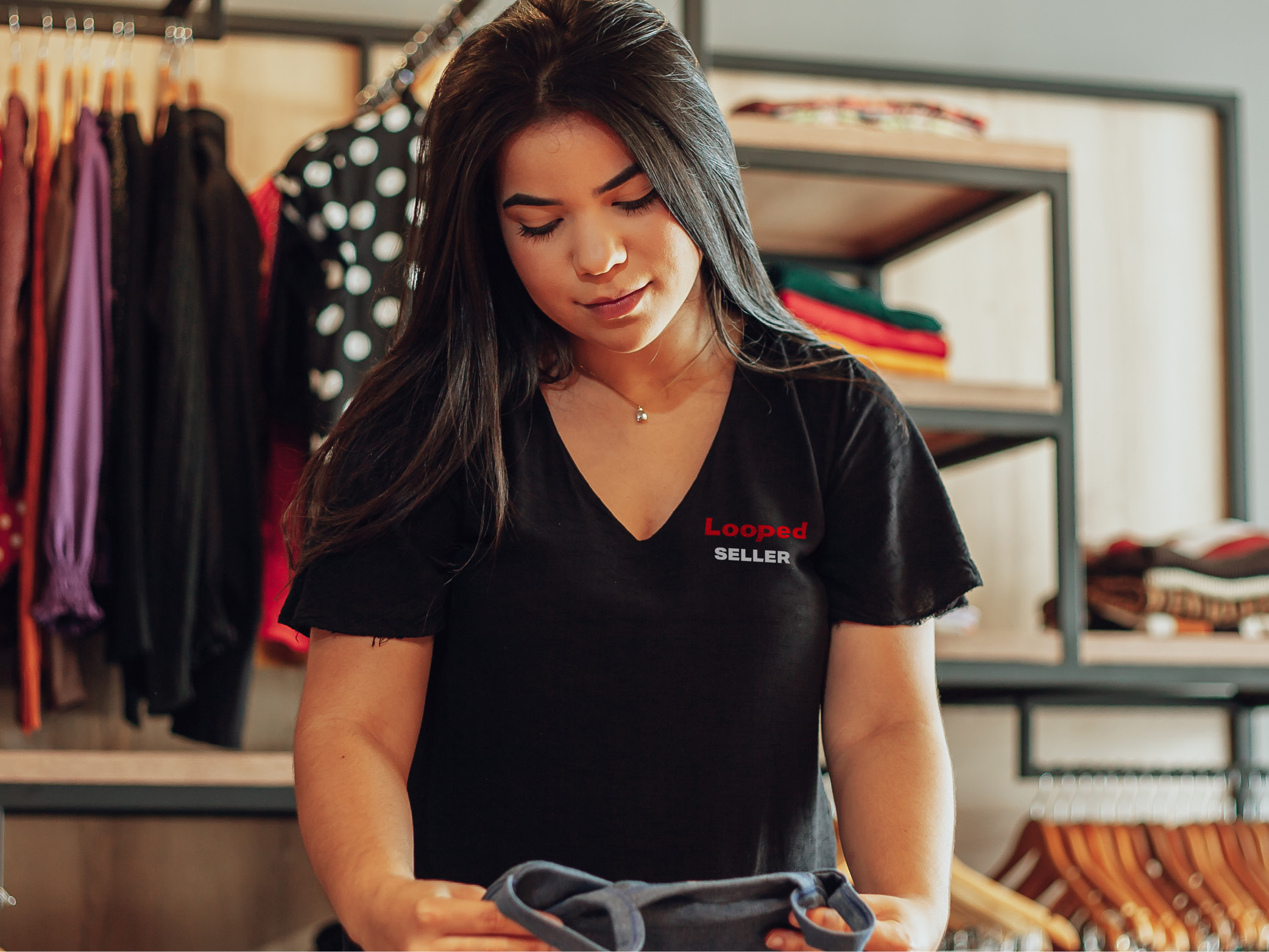
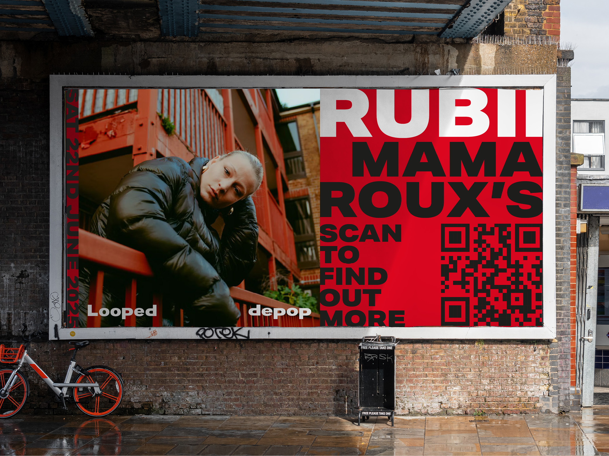
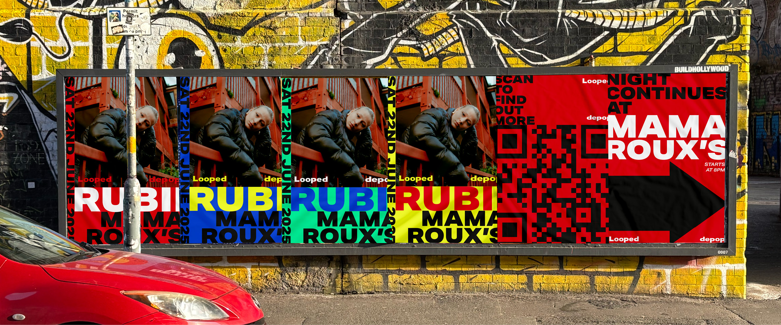
Looped is a campaign concept that brings Depop into the real world through a curated pop-up experience that blends secondhand fashion, music, and youth culture. The event begins at Red Brick Market in Digbeth, where independent Depop sellers set up stalls in a community-driven, vintage-inspired setting. As the day transitions into night, the event continues at Mama Roux’s, a local club space, where guests can connect through music and celebrate their individual style. The campaign is supported by integrated in-app features including ticket access, event info, and exclusive content. Around Birmingham, a series of bold posters and wayfinding designs build anticipation and guide visitors on the day, creating a physical extension of the Looped identity. Local artist Rubii headlines the evening, with her track featured in the teaser video to hint at her involvement and build hype. The video itself follows a Depop user’s journey through the event, visually capturing the energy, aesthetic and values at the heart of Looped.